The idea of anti-aliasing is to use grayscales on an otherwise black/white rendering to increase the visual resolution of the desktop. Desktops usually have a resolution of about 72 dpi, while every printer can tell you that 300 dpi is a good resolution for sharply printed characters. In other words, anti-aliasing tries to get closer to 300 dpi with a bit of trickery. Instead of a hard black-and-white decision on each pixel, it tries to allow more intermediate choices for half-covered pixels. Our eyes tend to like it.
Have a look at the following screenshots from a terminal session. They are enlarged by a factor two, so your screen pixels appear larger than normal. Please make sure that the image is not scaled by your browser, as that would elude the effect. Try to make out which you like best.
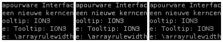
These three images are manually edited pictures of characters. They are displayed at double size, to simulate a monitor twice as course as yours. Have you figured out which is your favourite? Then read on.
- Left
- The original image, as rendered with anti-aliasing.
- Middle
- The same image, with more emphasis to the characters and with less anti-aliasing surrounding it.
- Right
- In this image, all traces of anti-aliasing were removed. The result is a pure black-and-white image that could have been produced by a straightforward font-drawing routine.
If you are like me, you prefer the middle form of display. In comparison, the right one is a bit too square, since the roundings in oo are turned into sharp corners. The left one on the other hand, is a bit smeared; there are fuzzy characters like the w which do not even contain the full intensity of the normal character. No wonder that this looks smeared! And this is naming just a few problems.
Font rendering on low resolutions, that is, mapping a scalable font onto a matrix with a limited number of pixels, is an art in itself. A great source of information on this matter is Knuth's METAFONTbook, in which chapter 24 is devoted to this kind of problem. The following contains Knuth's insights as well as my own.
Automation gone astray
The blurred effects in comparison to fonts drawn to scale are a result of scaling fonts, and for smaller resolutions the automated scaling features do not work well enough. This is common graphical knowledge.
There is a possible mid-way which would improve the visual resolution without blurring characters. If fonts are manually drawn to scale, but with the use of grayscales, then grayed-out pixels are functional for that particular scale, but they won't cause blurring of pixels that ought to be blacker than black, or whiter than white. Terminals should not use scalable fonts, but only fonts intended to be drawn at their respective resolution.
The real challenge is to automatically render a good font from a scalable resource. This would make fonts available at all scales, without the need for them to be manually drawn. Manually drawing a lot of low-resolution fonts is a lot of work because the differences between characters are quite big at low resolutions.
The METAFONT rendering engine is capable of rendering fonts in this manner. This part of the LaTeX toolkit works with small 'font programs' that draw and fill character shapes. A major concept supporting the above reasoning is METAFONT's distinction between sharp pixels (at idealistic positions) and rendering positions (which take pixelisation into account). For LaTeX. the generic cmr font is mapped to a size-dependent font, cmr10, cmr11 and cmr12, selected according to the intended layout size.
The result is that a user does not see one font at a variable size, but as many fonts as have been pre-rendered to size. This is not uncommon; for X11 displays for example, it was used a lot.
Rules for rendering
METAFONT may be a workable tool because it can be programmed to smartly render scalable fonts to low resolutions. But what would be good design issues to put into a terminal-ready font?
- Design for post-scaling
METAFONT cannot generate grayscales on its own, but it should not be hard to add a small backend that reduces the font in size, while introducing grayscales. The font design would have to be designed with this post-scaling in mind!
In practice, this means that rounding pixel sizes from 'sharp' to 'rendered' positions is not done to METAFONT-pixels but to post-scaling pixels. If METAFONT draws 4x4 squares and post-scaling determines a gray intensity by counting the pixels in those squares, then all rounding must be on fourfold pixels, rather than on unity pixels.
- Designing sticks
- Sticks sticking up or down from a letter's x-height should be a fixed number of post-scaling pixels wide. Furthermore, they should be drawn on a post-scaling pixel boundary to avoid smearing it out. This way, they come out of a post-scaler as pure black surrounded by pure white -- in other words, the stick will be sharply marked.
- Preferring the straight
There are places where a font designer can choose to add frills. The driving motivation should be readability, and for smaller resolutions it makes sense to leave out frills that only look good on higher resolutions. This could be done by conditional code in the font program.
To give an example, the lowercase h consists of a vertical stick, from which a curved line departs. It looks nice to make this curve bend up, then down until it ends in a vertical stick. But the initial rounding introduces places of less sharpness, and it may make sense to start with a horizontal line instead. This is just as readable, but less blurry. In general, it makes sense to consider abolishing round lines from a font.
- Angular lines
Some characters in a font use a straight line under an angle. For example, the letters k` and w, as well as the slash. To get the most out of these characters, they should be drawn at a tangent M:N with small values for M and N.
If at all plausible, 1:1 should be used. This is quite different from the freedom available for high-resolution scalable fonts. However, this rule avoids blurry and inconsistently rendered characters. The beginning and end of a line should be a post-scaling pixel position, so that at least the end points are sharp.
The width of an angular line is a matter of taste; ideally it should have a horizontal and/or vertical width of one post-scaling pixel, but this may turn out to look too heavy.
- Curved lines
When curves cannot be avoided, such as in the p and R characters, it is good to introduce grayscales during the post-scaling process. These gray accents support the reader in believing there is a curve going on, rather than a straight line. It is the main reason why the middle image looks better than the right image.
One thing to keep in mind though, is that the characters may turn out to be more readable if the position of the curves is clear. This avoids smearing in places where it is not necessary. As a guiding principle, try to start and end curves at post-scaling pixel boundaries.
On most modern desktops, there are two flavours of font that should look well together. One flavour is fixed-width, for use in terminals and for reading plain text. The other flavour is variable-width, usually without serifs, used for window titles, menu's and other places where the layout is tool-determined. Since variable-width fonts can be made more compactly, both styles seem undispensible to have follow the above rules.
Reverse mode rendering
One graphical problem that would need to be addressed in relation to this problem is the difference between black-on-white displays and white-on-black. A font that works well in the former, is likely to underperform in the latter. At this point, I do not know why, let alone how to solve it.
Conclusion
To summerise, I think it is sound to use anti-aliasing for small fonts on low resolutions, but the fonts should be optimised for the resolution at which they are to be rendered. However, I am not going to try and convince the author of Ion to incorporate this into Ion -- because that would only apply to title bars. I am going to look for a terminal application that supports anti-aliased fonts, and load a decent font into it.
 Vertaal naar het Nederlands